What’s different?
I suppose everything is different now. Before, I had the perspective of re-imagining an abandoned, disused space in my neighborhood. Now that I’m older and no longer in the area, what would attract me to visit somewhere like Coffee & Donuts? Who is the neighborhood demographic? How has the neighborhood changed? How have tastes changed? How have MY tastes changed?
The new challenge is to rethink how a brand and business like Coffee & Donuts can evolve to meet current tastes and needs, while also be open to growing and evolving sustainably.
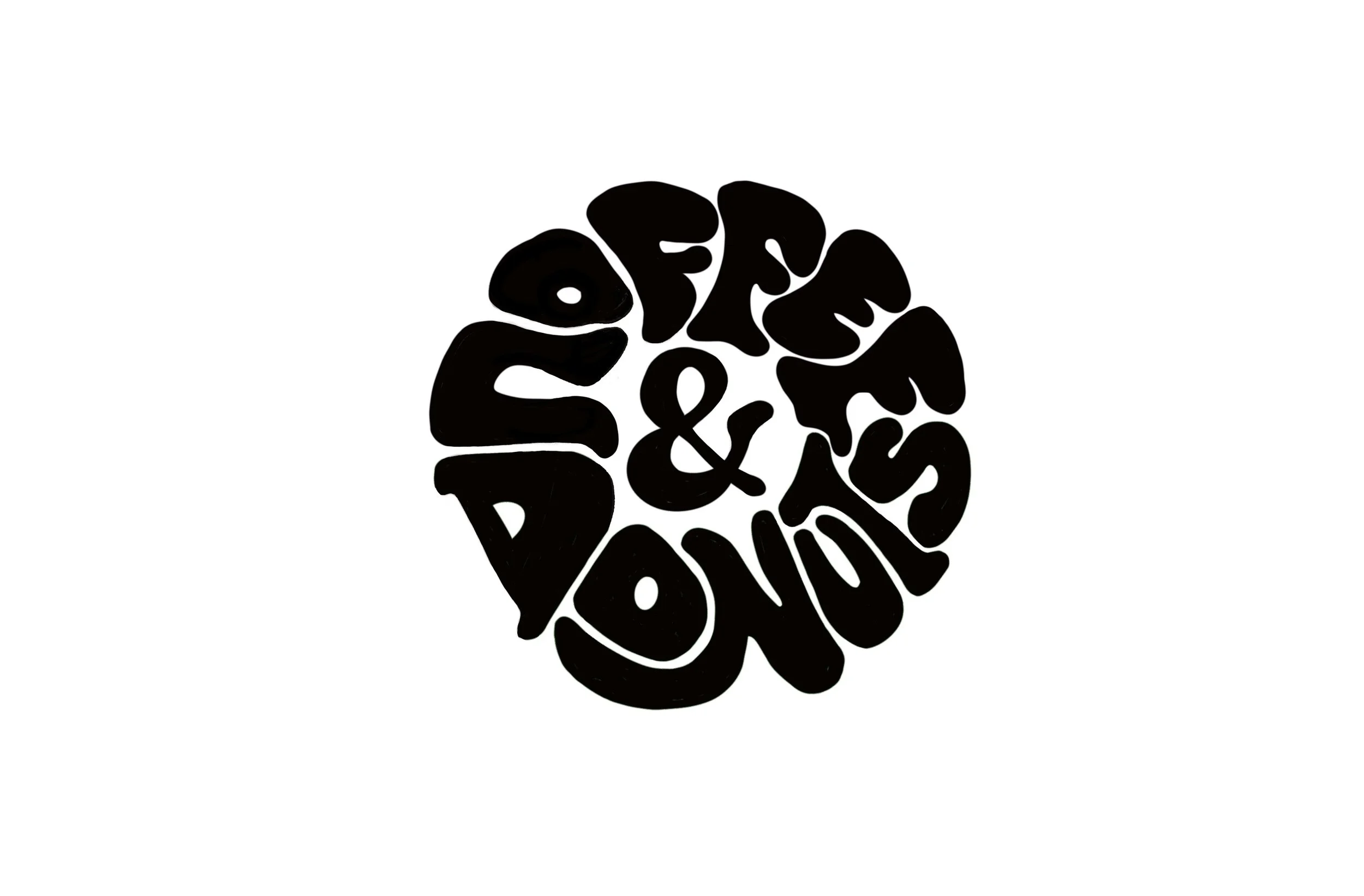
Spitballing led me to redrawing the logo.
What if I went in the total opposite direction, and went into hand lettering? Hand lettered typography is something that always eluded me. Even though I have a traditional illustration background and also have kind of made myself known to be a type dork, I always really harshly judged any attempts I made at drawing logos or letters of any kind. This time, instead of immediately giving up, I just kept refining, editing, moving things around. I still don’t love it, but I appreciate that it made me think a little differently and pushed me out of my comfort zone. I’ll probably keep messing with it in perpetuity.
I gave up on the logo for a while and just drew coffee cups. Another thing that I’ll probably just keep drawing forever. It’s kind of therapeutic and lets me mess about with Procreate brushes. The pink cup led to a poster, though.
Then I just started making posters with the mug. I make fun of “drops” and the sneakerification of everything, but it’s also a goofy and fun thing to play with as a concept. In recent times, some coffee folks have definitely taken this stance and run with it, and I am not immune to its charm.
Instead of fully drawing the logo, I used a more friendly, poofy typeface, but kept it to just the logo, and styled it for a very specific use case so it doesn’t overpower. And yes, I’ve succumbed to late 80s and 90s serif type style. I don’t know why it clicks with me - maybe I’m just feeling some childhood nostalgia? I do enjoy that it both can look “professional”, but also exist in a completely tongue-in-cheek, campy way.


