Building a Foundation
When I decided to revisit the Coffee and Donuts project, a big question I had was...
Why?
Portfolios, studio sites, Behance projects, and school assignments all include a rebranding project, real or imagined, especially for food and drink branding. It’s easy to see the appeal: food and drink branding engages a huge cross-section of design disciplines. You can create logos, brand guidelines, social media posts, photo and illustration styles, packaging, a website, an e-commerce or app experience, out-of-home collateral, branded environments, and more. So functionally, it’s a great way to flex your design chops. I’ve had work like this, other than Coffee & Donuts, in my portfolio before.
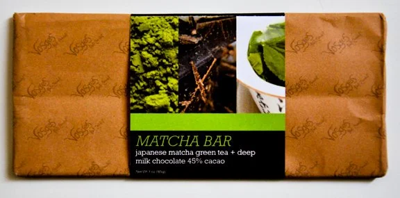
This is an old school project where I had to redesign packaging for 3 Vosges chocolate bars. Vosges actually sent me an email, worried that I had leaked confidential work, which was kinda flattering.
While these exercises are important, it’s equally important to understand that branding doesn’t exist in a vacuum in the real world. Whether it’s a logo for a small business or an expansive, international corporate brand suite, both require an understanding of brand goals.
Playground originally started as a simple redesign, but working on it inspired me to look deeper. What are the goals of Playground Coffee? What is it and what is it about? I started spitballing in Figjam:
Once I got a few ideas down free-association style, I organized them into general idea buckets. I noticed that some of the stickies were more “what” Playground could be, and some were “why”s to support them, so I created those larger buckets and made connectors between the related ideas.
I also created a couple of quick mood boards with some notes for the look and feel of both the brand identity and the physical space.
I envision a cool, well-designed, multi-purpose cafe: a coffee shop with food, a meeting place, an event space, and a gallery. A true third place. I like the idea of juxtaposing clean, punchy typography with more whimsical, maybe anthropomorphic, illustrations for the brand identity and packaging. All in all, I want it to be a space and brand that’s “aesthetic”, but also purposeful and approachable. A coffee shop that is insta-friendly but still invites people to interact directly with the space and brand. I think a lot of cafes in Asia (South Korea, Thailand, Malaysia, Japan, Hong Kong) get this balance right, and I’d like to channel that energy while developing Playground’s main concept.
In the next post, let’s drill down some specifics.


